Independent Schools Australia
CHALLENGE
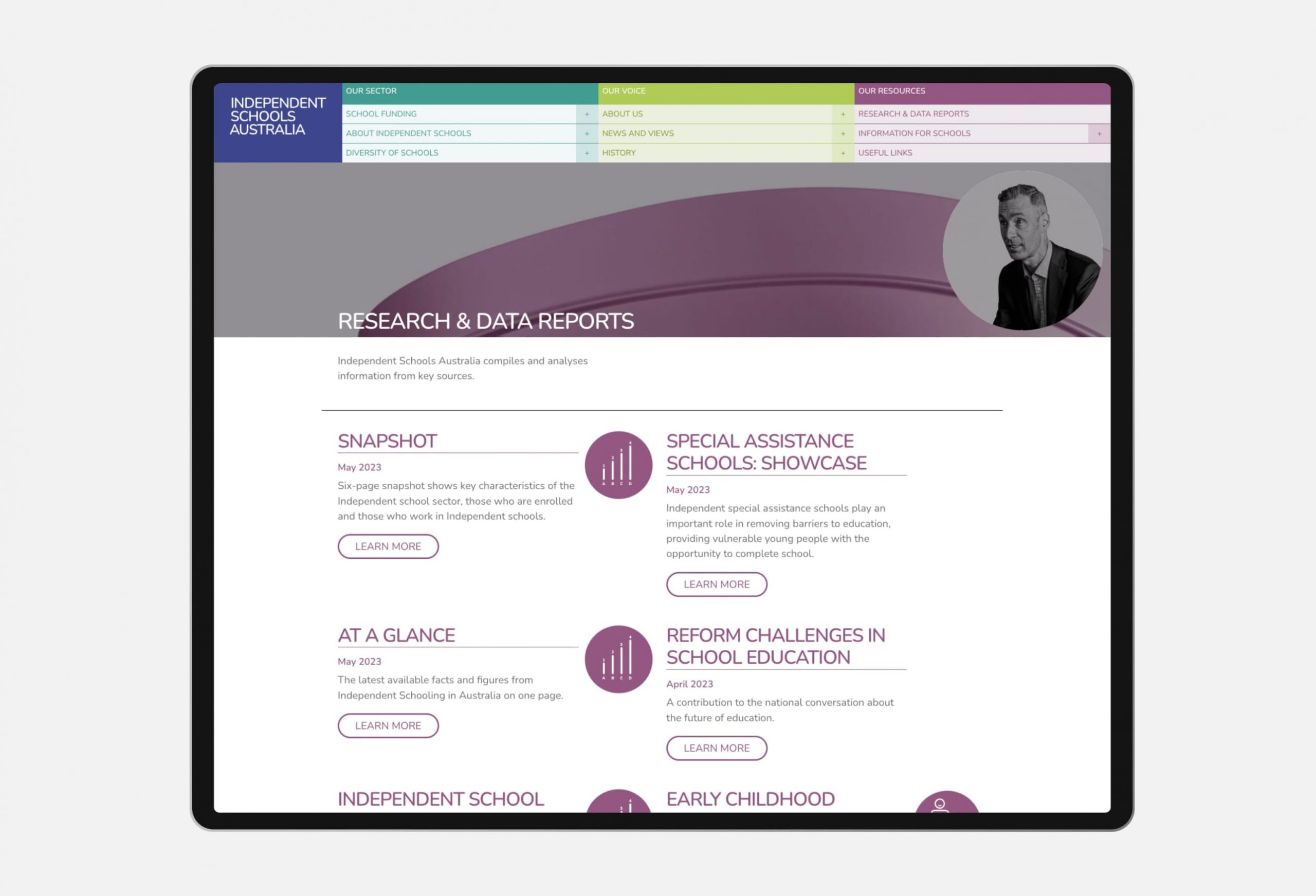
Following an extensive rebrand and strategic repositioning, the organisation required a full audit and evaluation of their online presence. The existing website contained a large catalogue of publications, media and reports. A review of the content and user-flow forms the basis for a complete site restructure and rebuild.
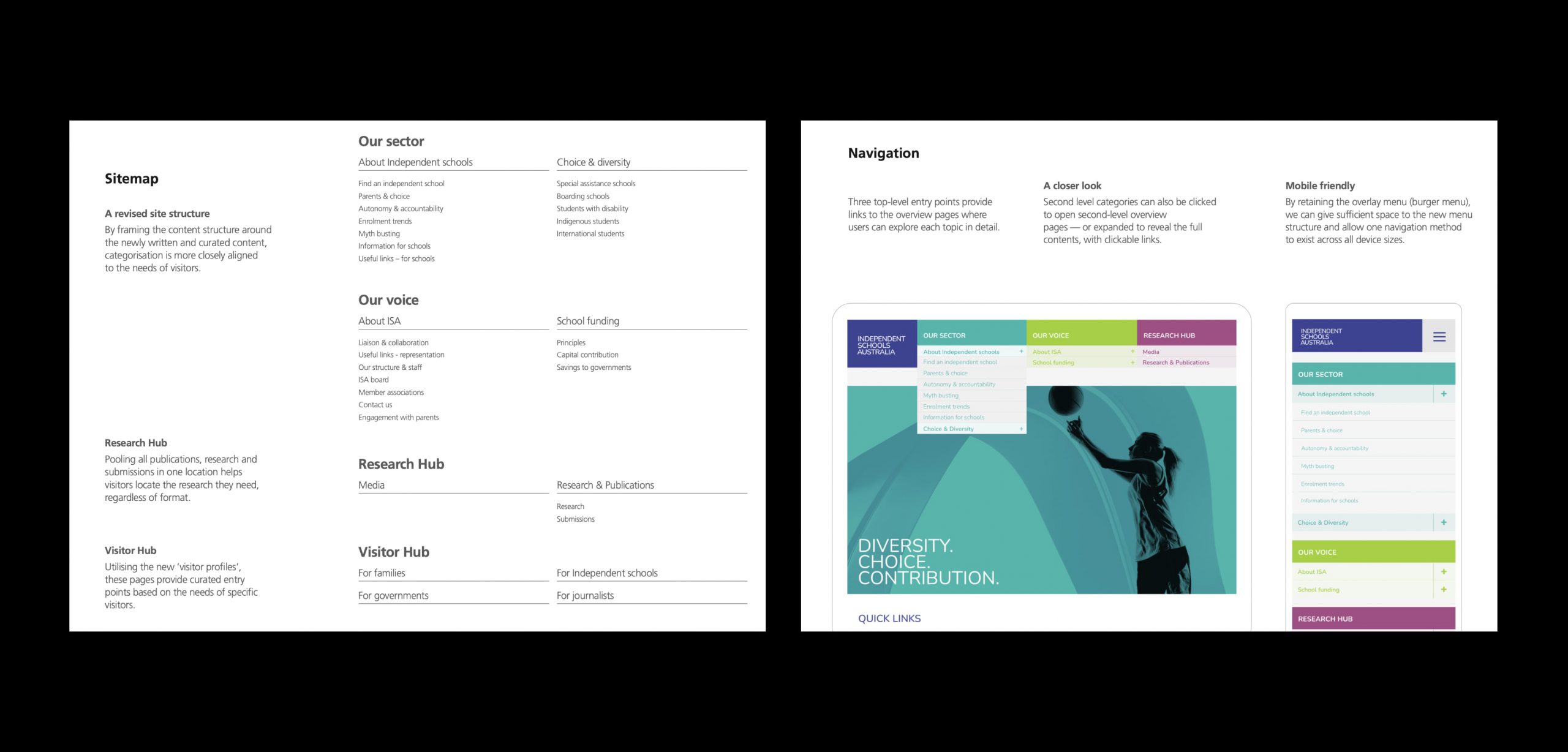
Sitemapping
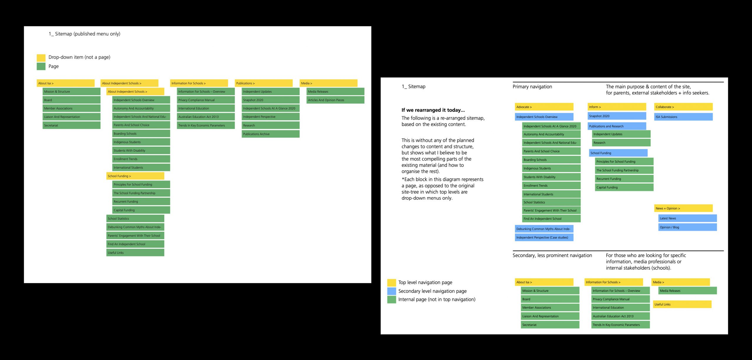
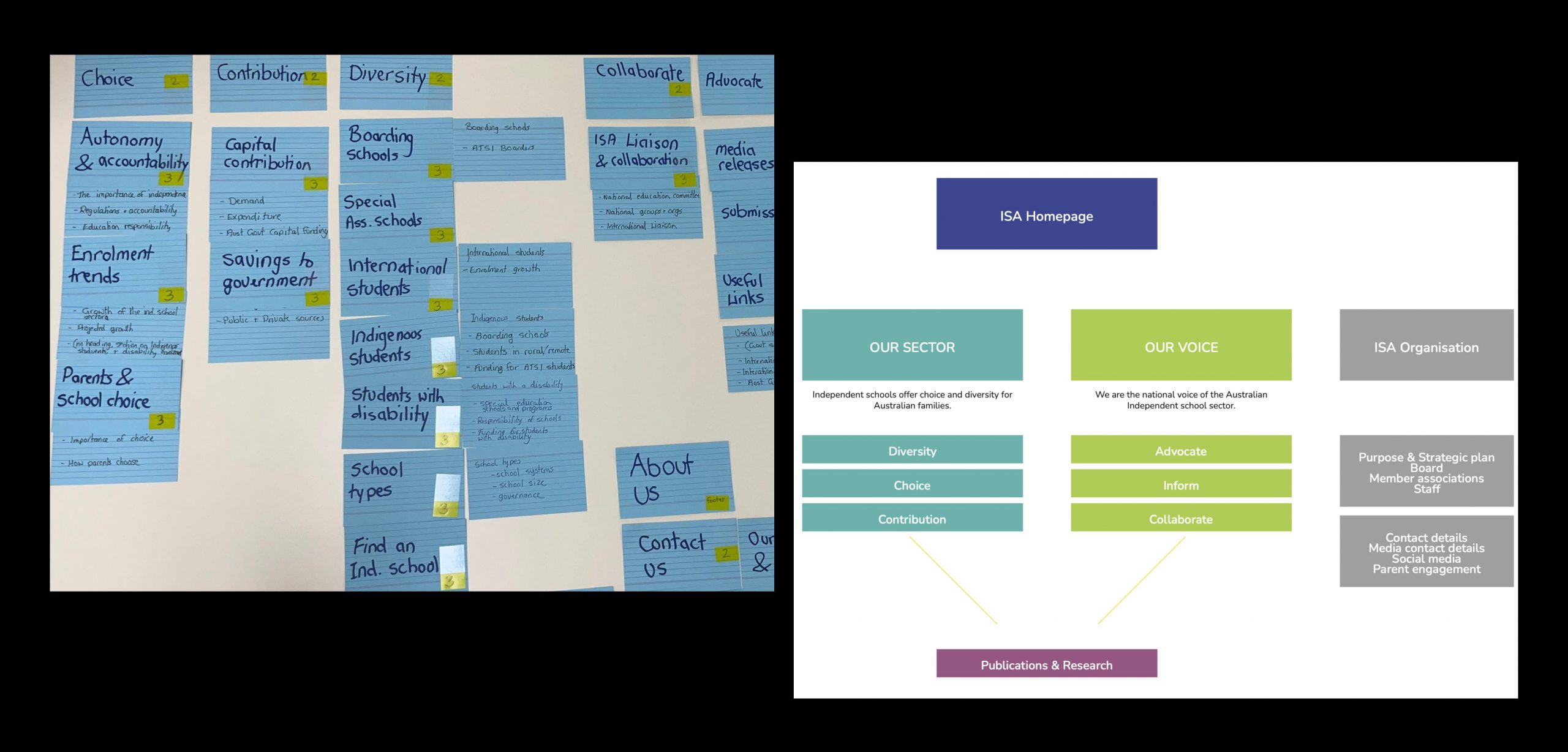
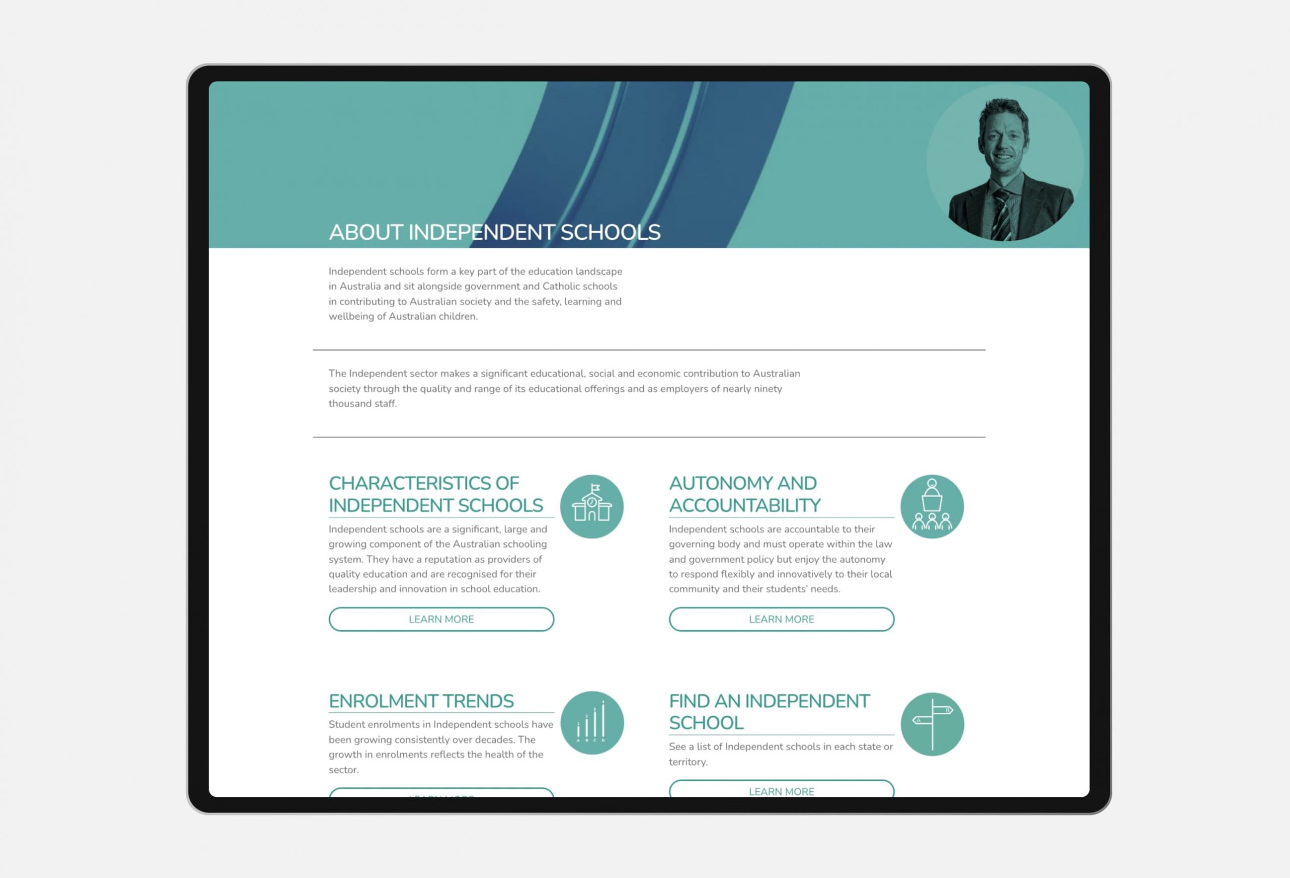
A review of the existing website and content revealed hundreds of documents and reports which were difficult for users to find, and for staff to catalogue. The existing site-tree was examined and restructured into more meaningful categories.
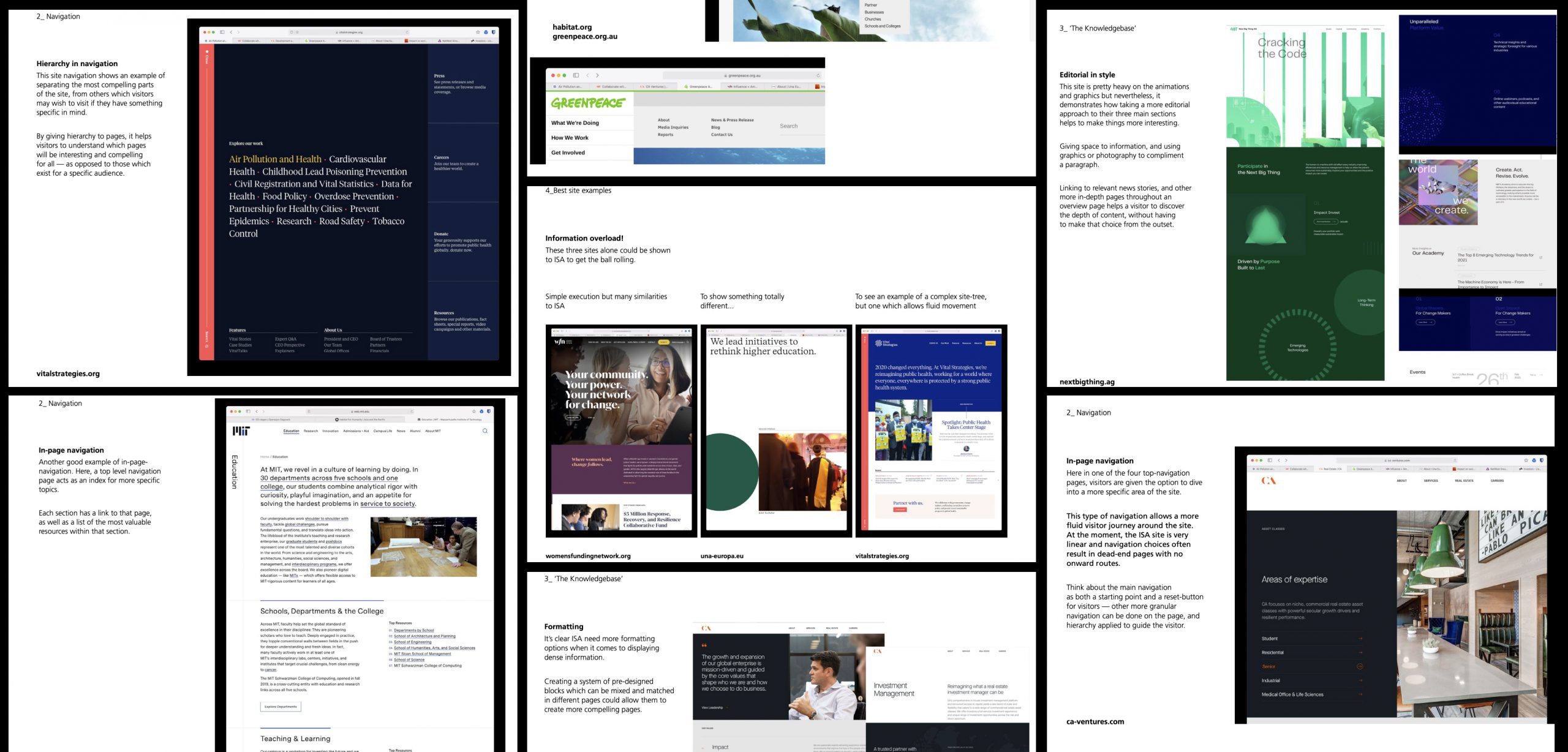
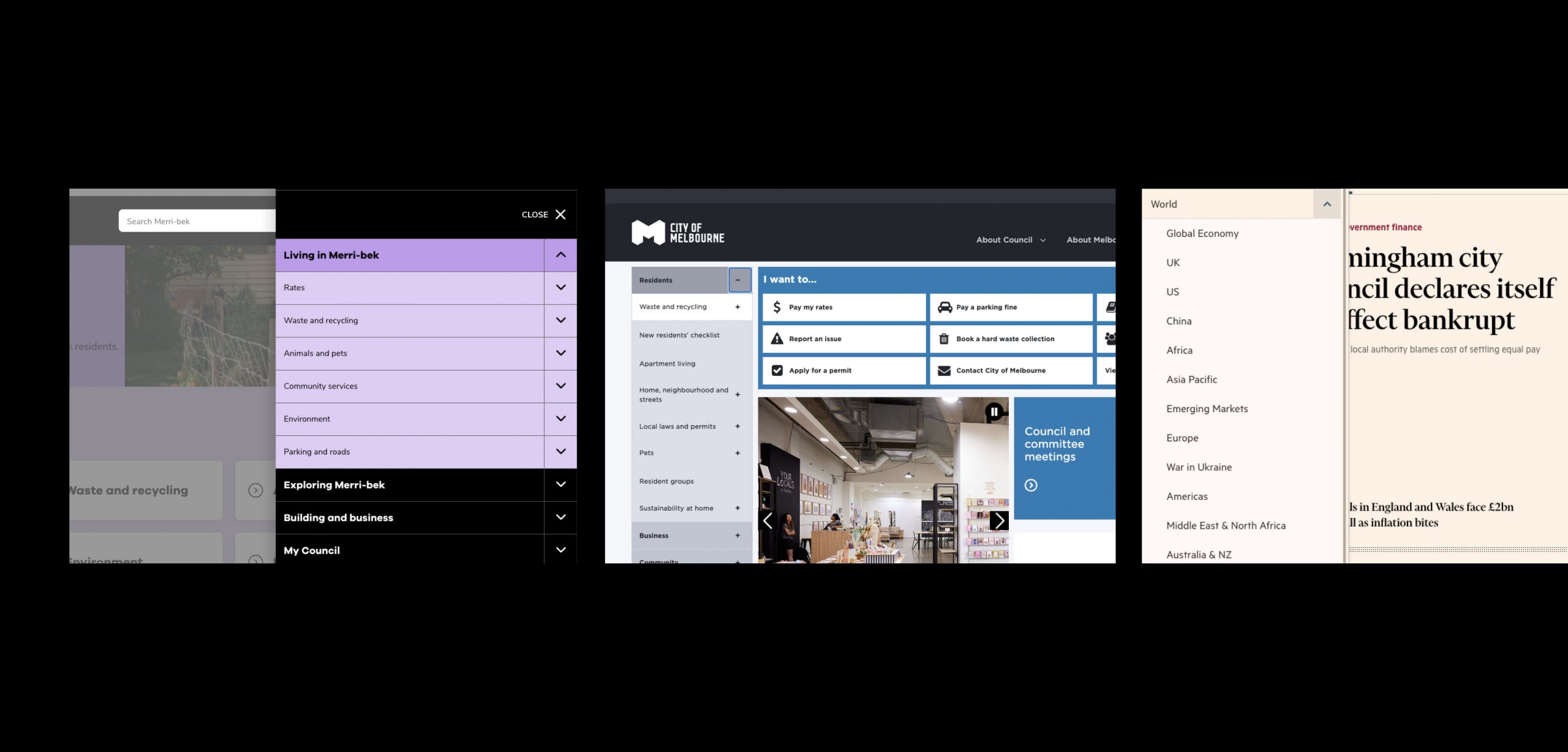
A competitive landscape analysis study is conducted and best-practices identified for important aspects of the site.
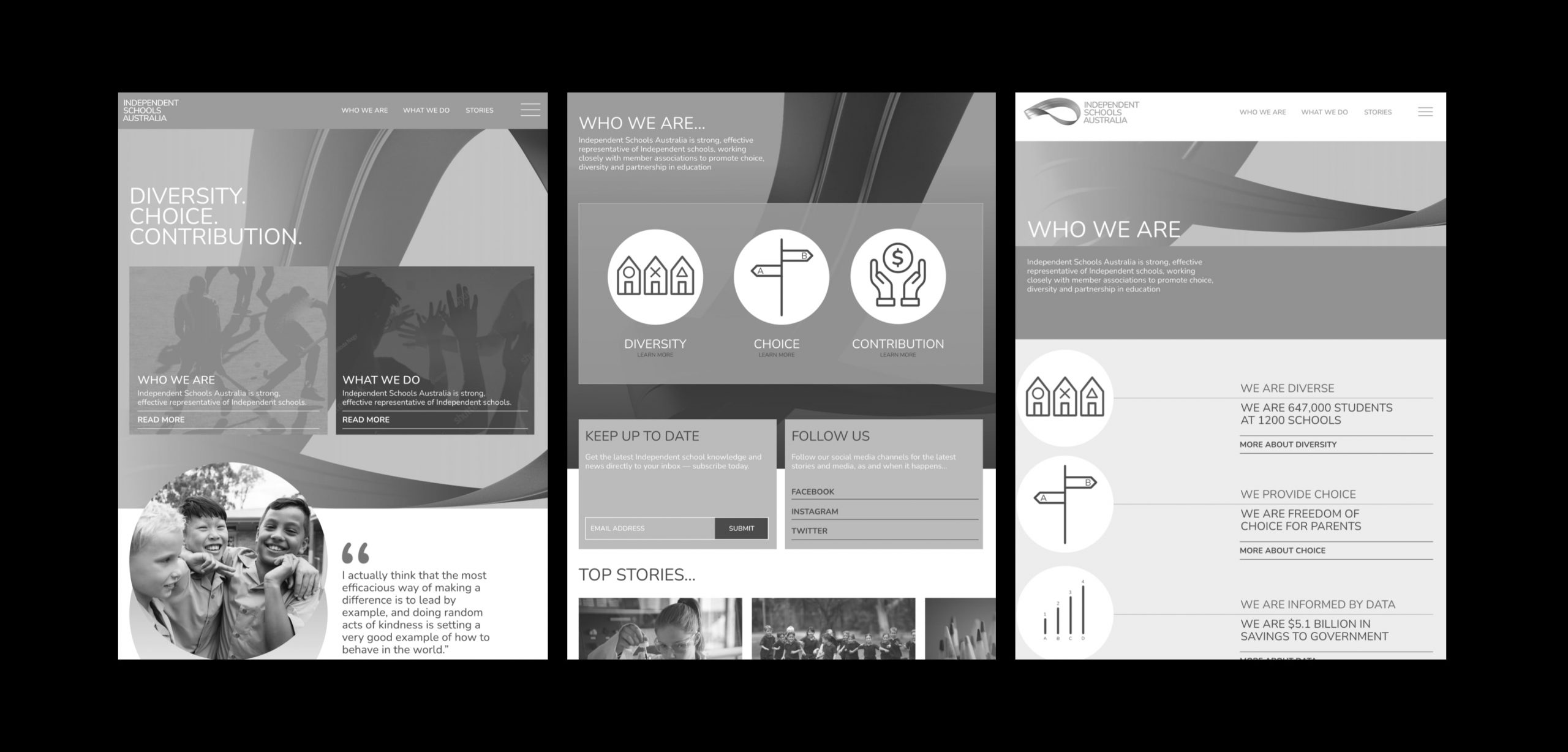
A basic high-fidelity wireframe is created to demonstrate functionality of key site pages.
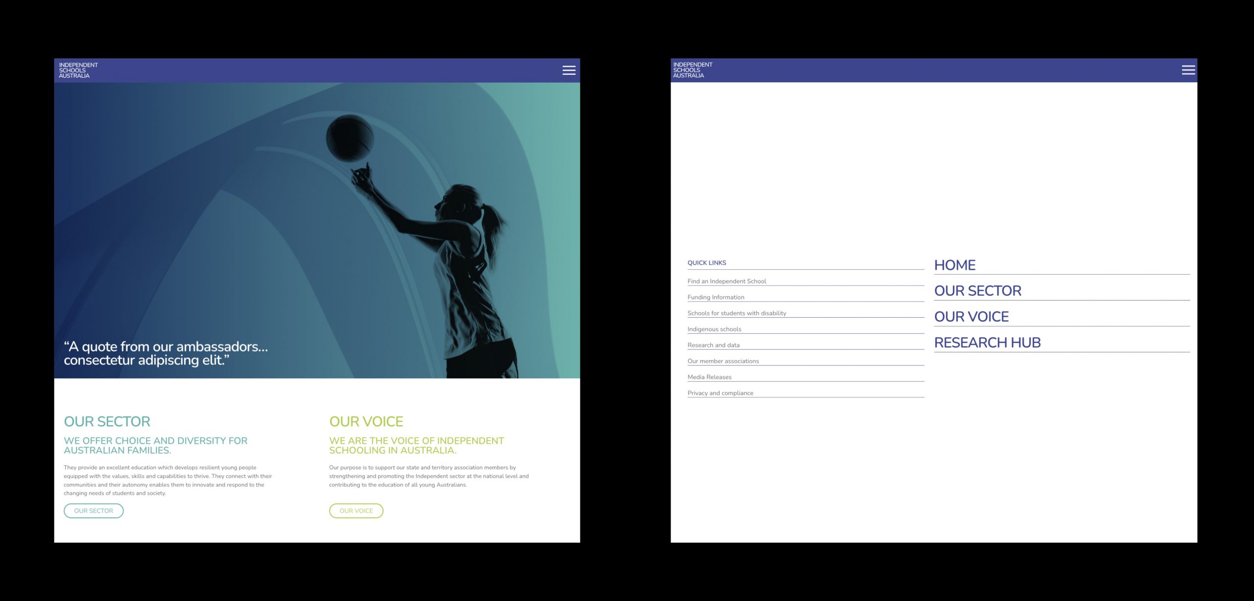
The site design is formalised into a structured, interactive prototype.
ITERATION
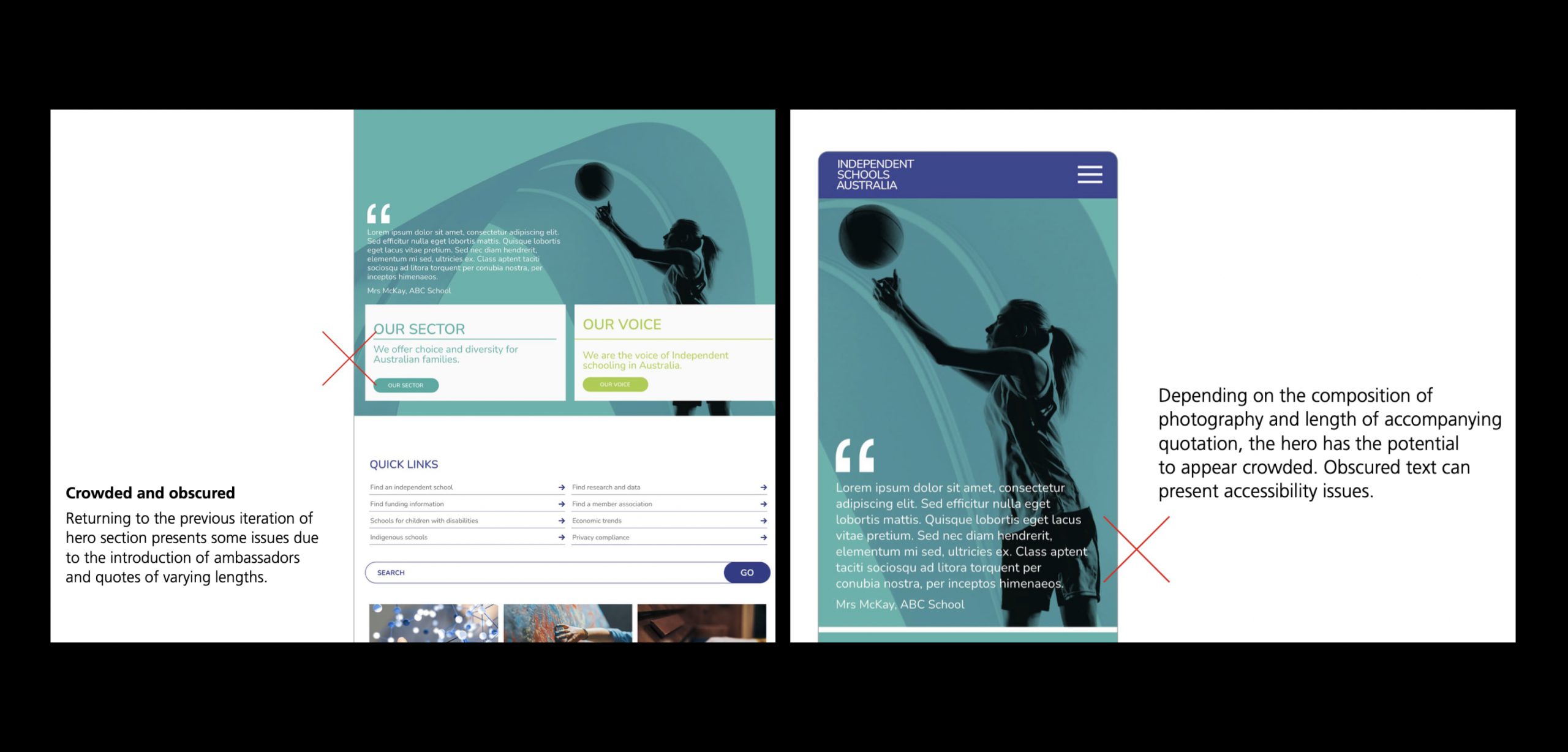
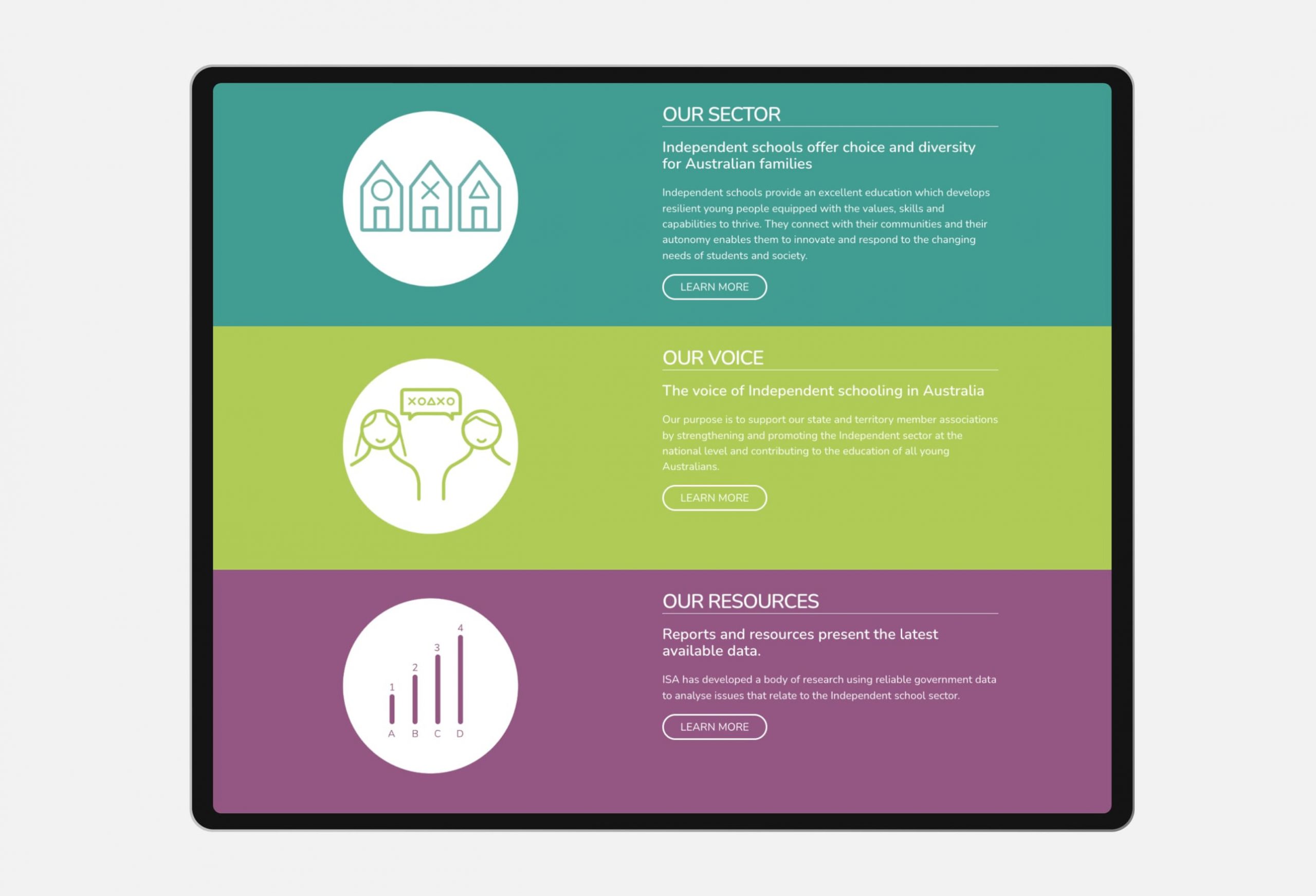
Following review and feedback from internal and external stakeholders, concerns are raised about the suitability of the proposed full-screen burger menu for navigation. The homepage hero is also raised as a concern on the basis that some users were unaware of content below. A process of internal iteration and critique is followed to find potential solutions.
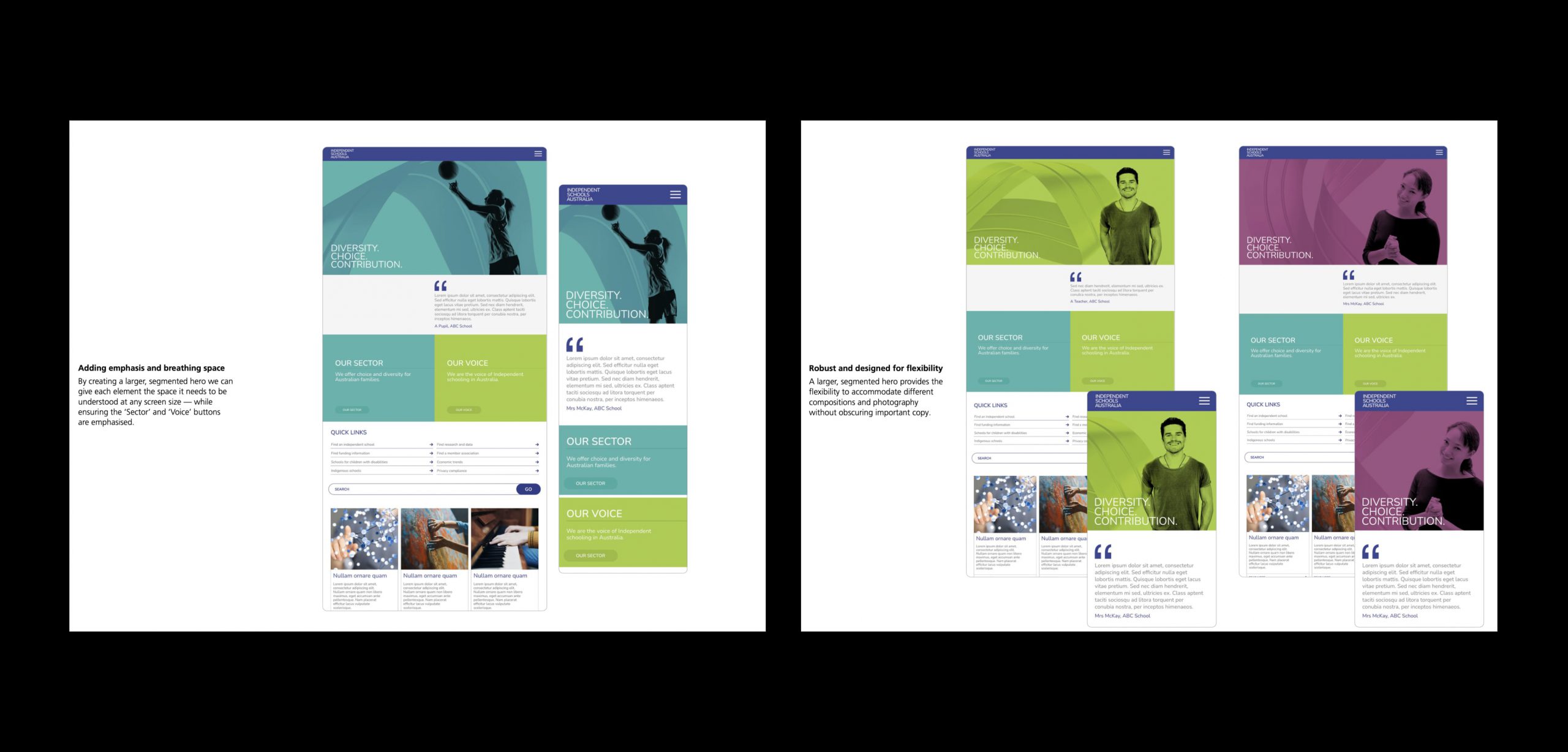
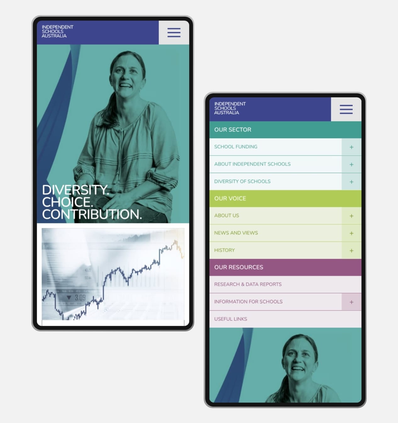
Following a period of internal design iteration and further competitive landscape review, a solution is selected which involves revising the site structure, navigation and page dimensions to improve usability.
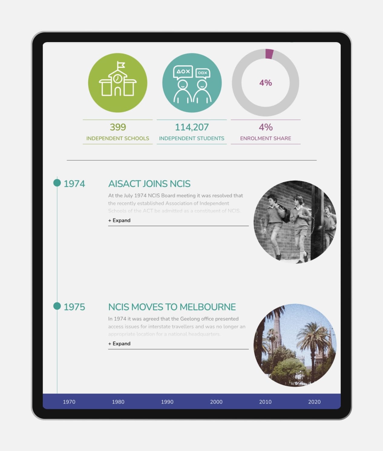
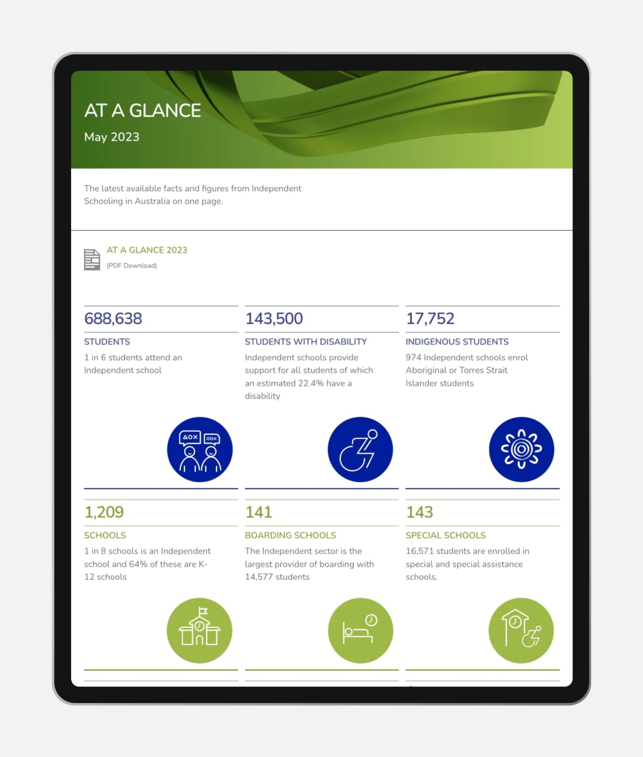
The extensive and varied history of ISA is presented in an interactive timeline which highlights important milestones and key metrics from each decade.

A comprehensive set of pictograms is developed to add context to ISA‘s publications.

