Musica Viva Tasmania
challenge
As an independent and volunteer run music festival, the organisation needed to make an impact with a younger audience and demonstrate the vibrant community which exists around their performances. My solution translates this story into a colourful, impactful identity which puts audiences at the centre.
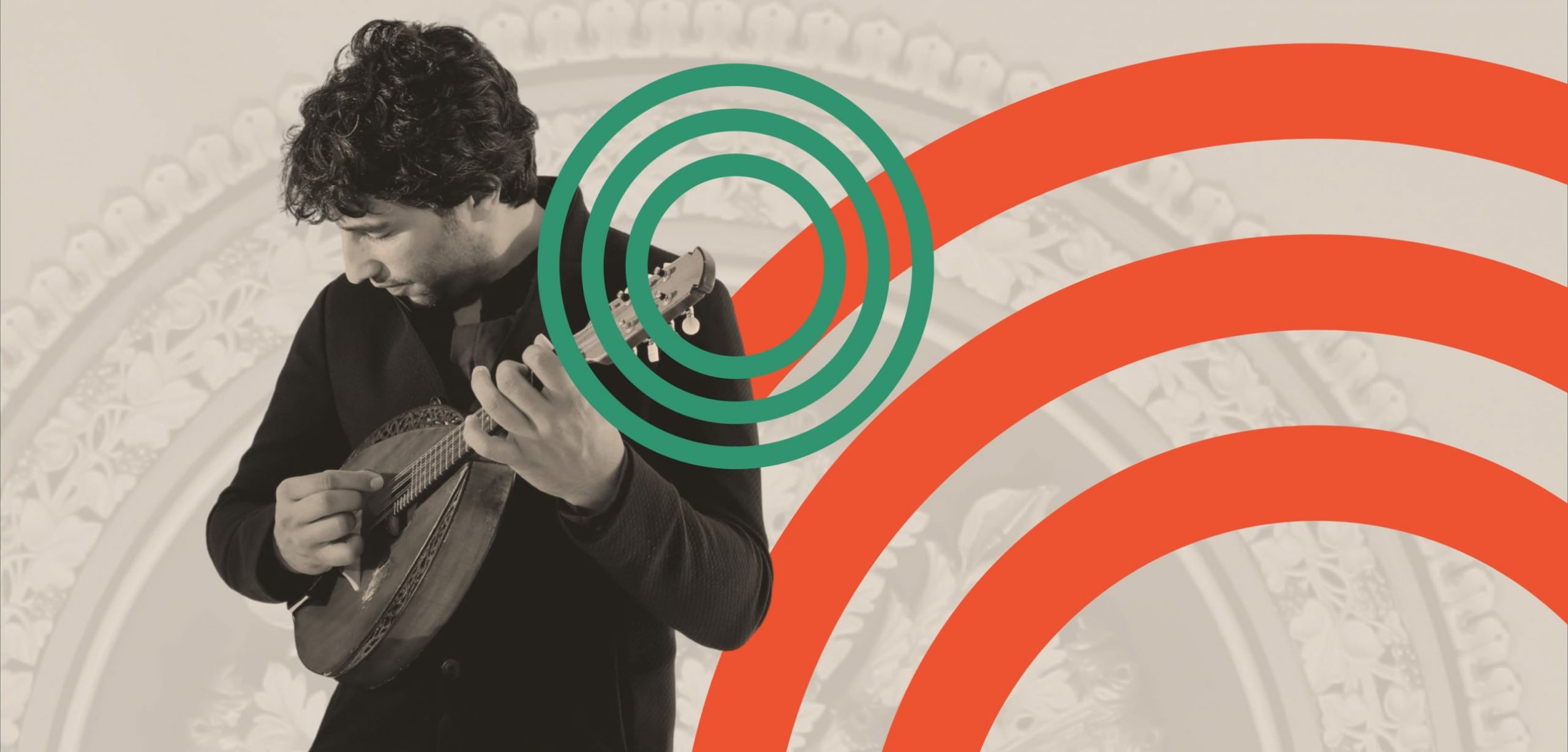
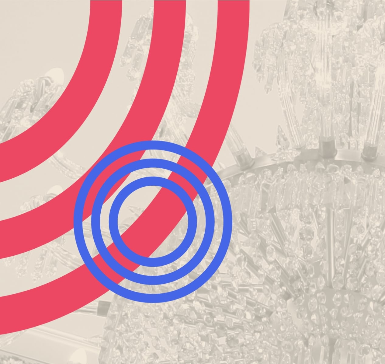
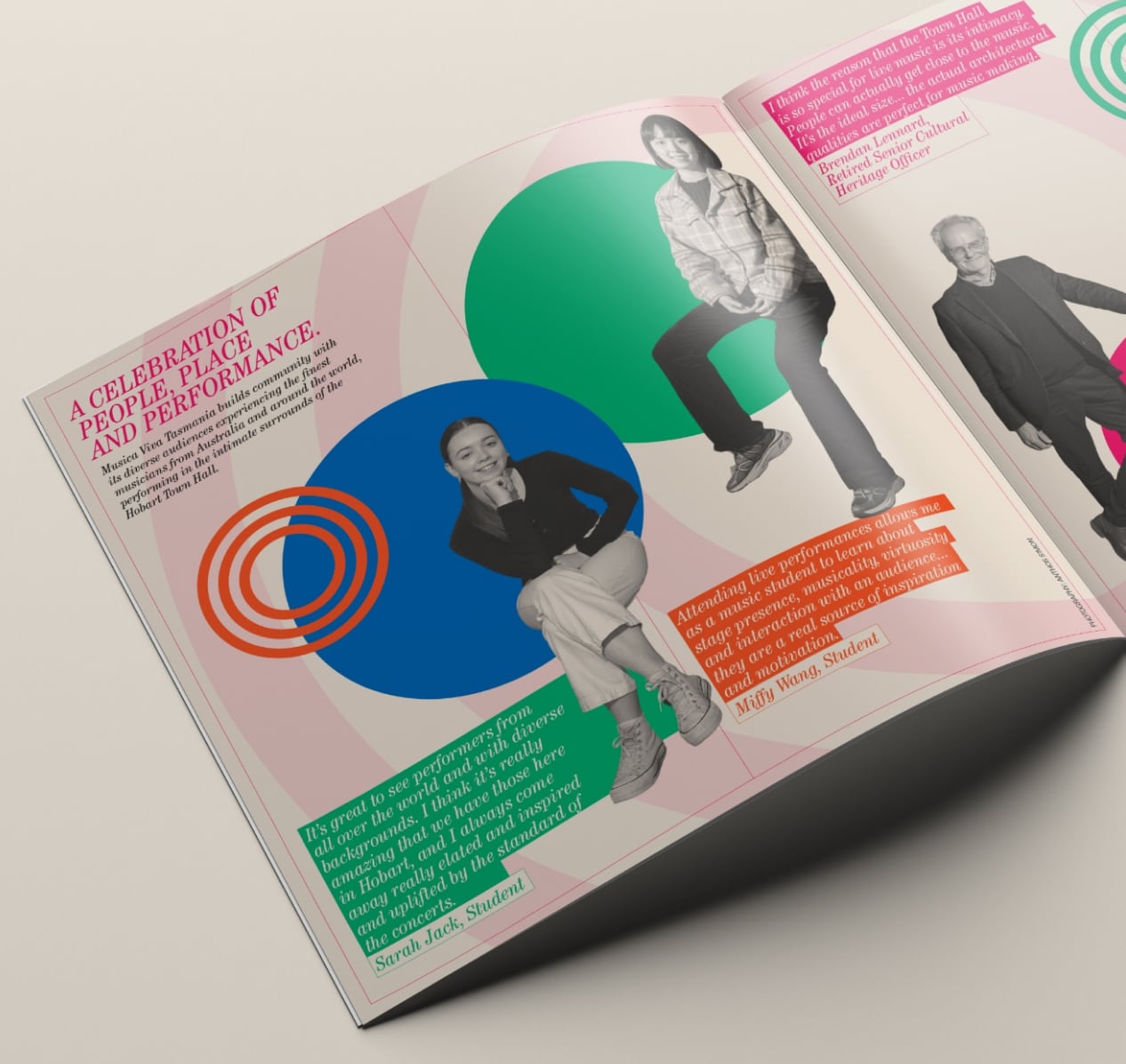
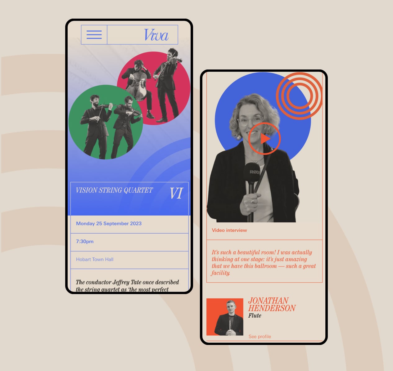
Audience engagement revealed younger audiences felt alienated by the traditional leaning brand identity. A refreshed identity formed around playful interactions of colour and photography is created to target a younger demographic.
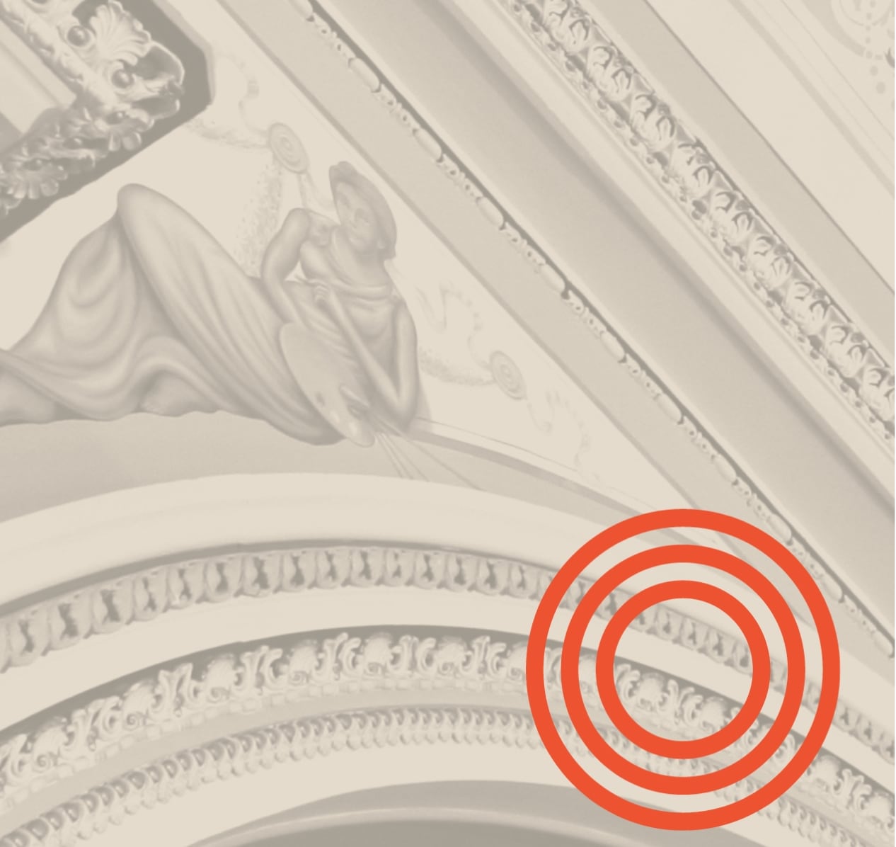
Stunning photography from the Hobart Town Hall ballroom is combined with the new graphic language to bring warmth and texture into the identity.
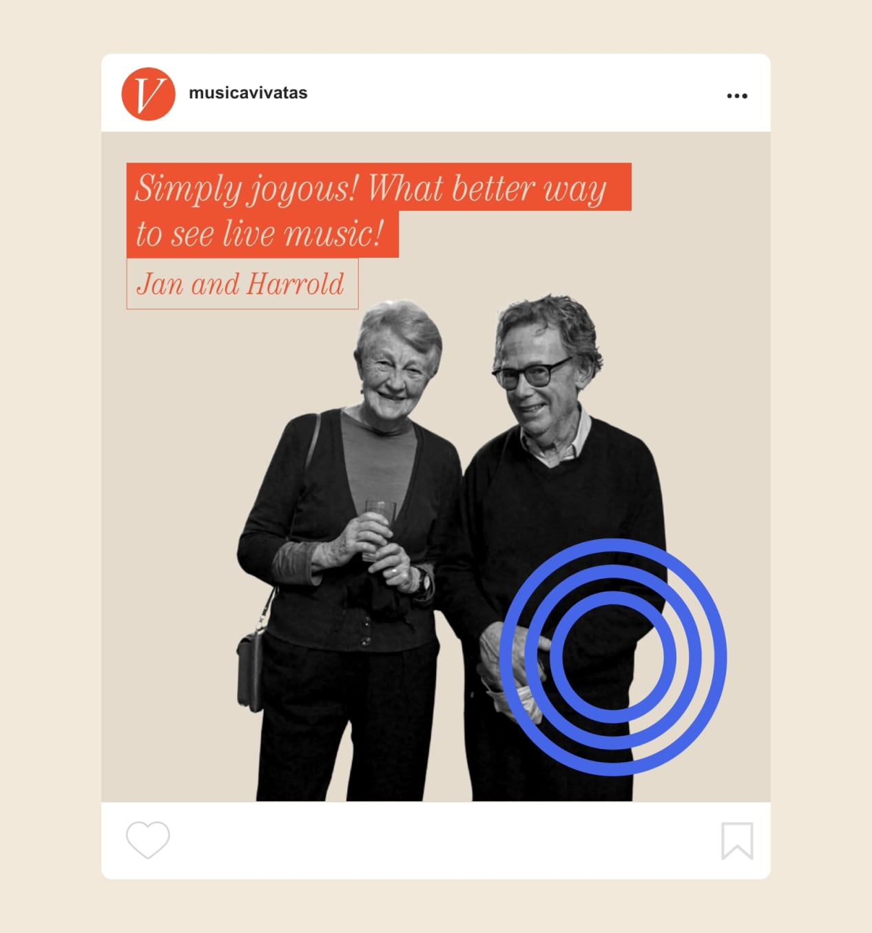
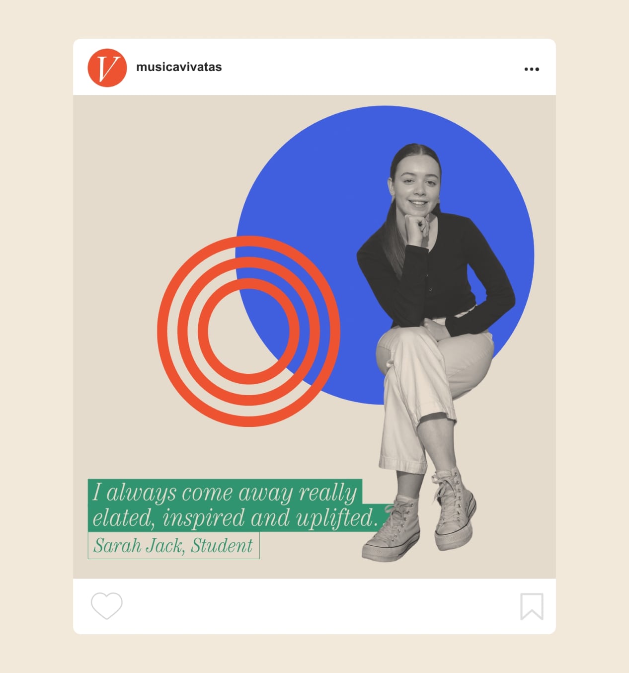
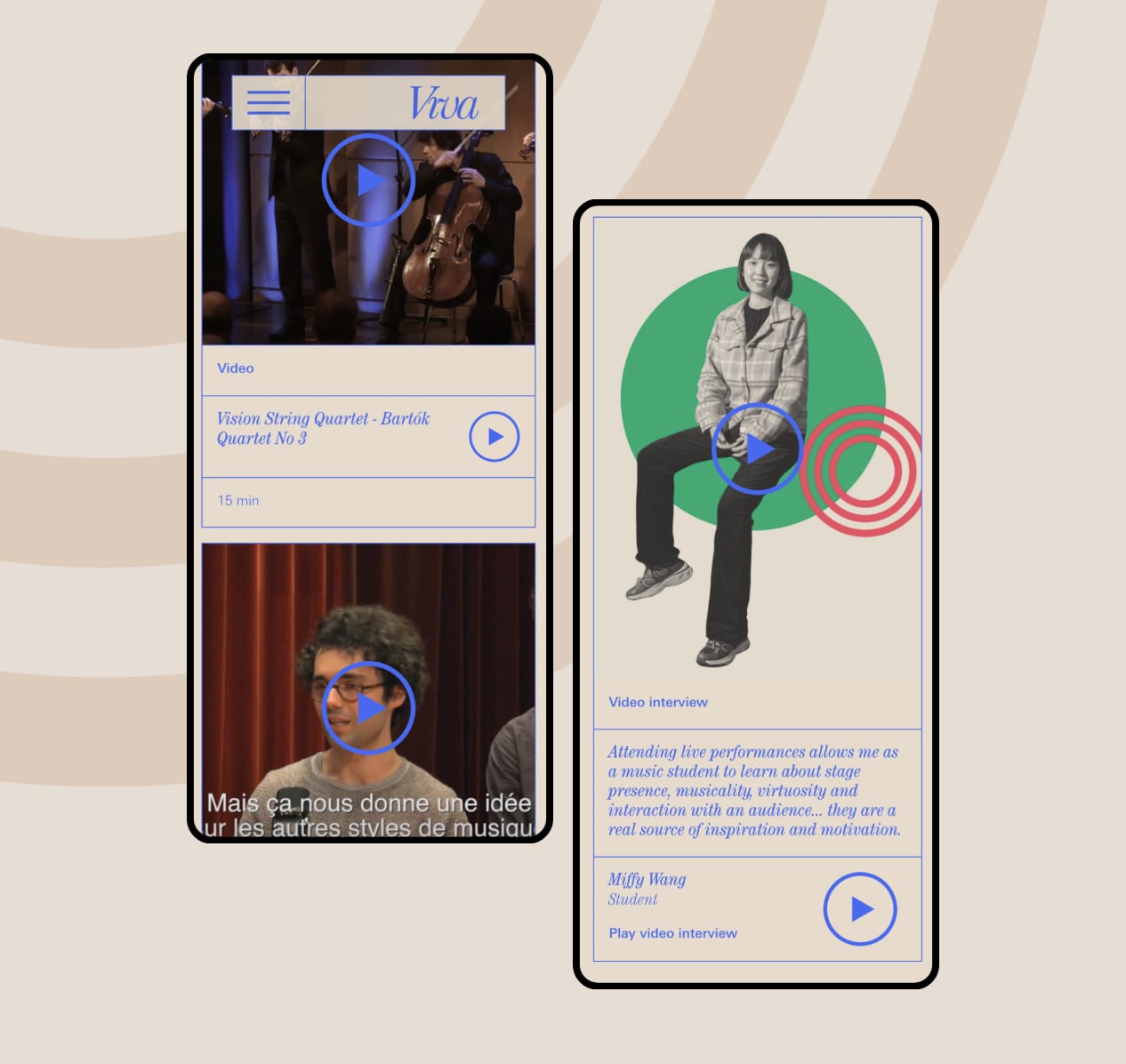
Analysis of the existing identity and communications found audiences were missing from the conversation. A series of interviews and photography was commissioned to engage the audience in conversation.
communications
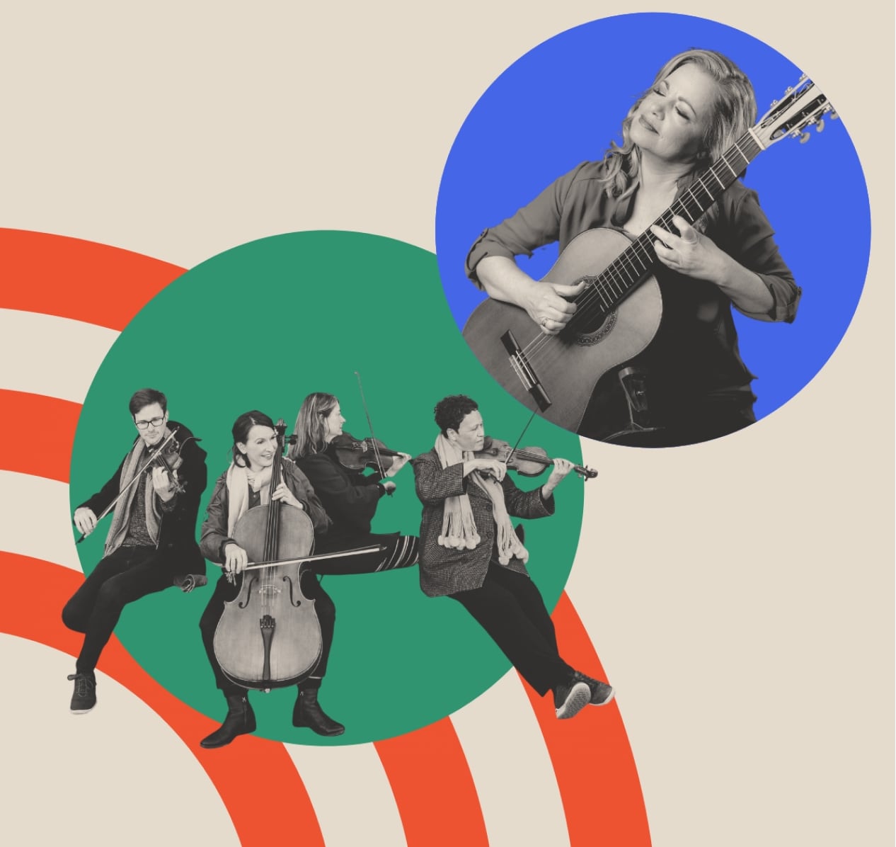
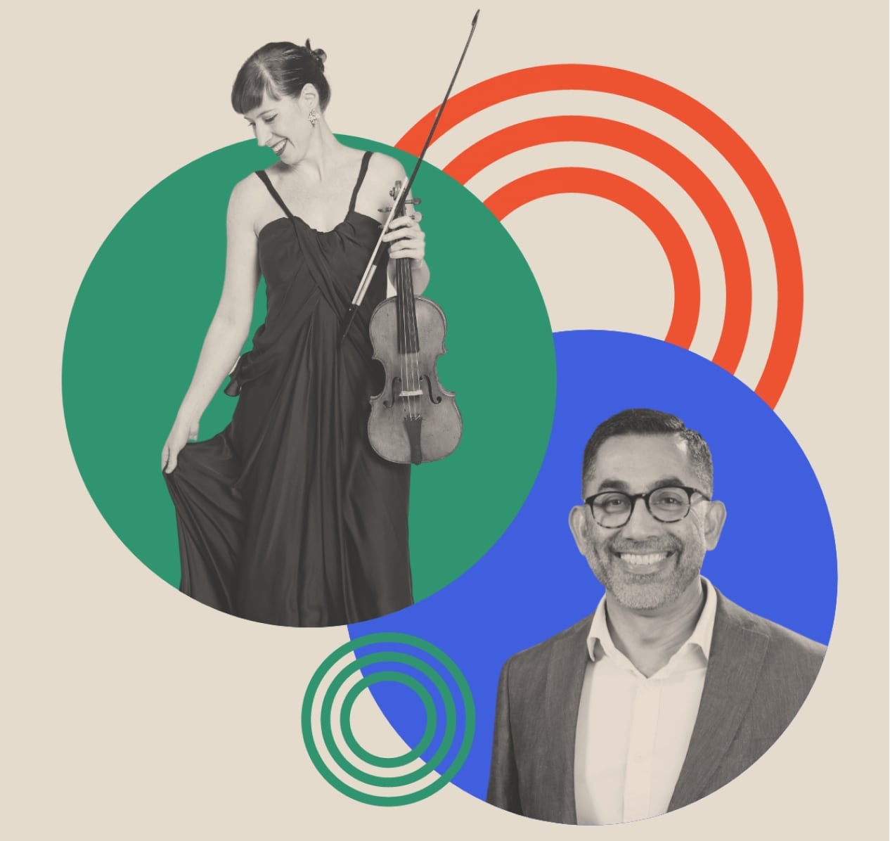
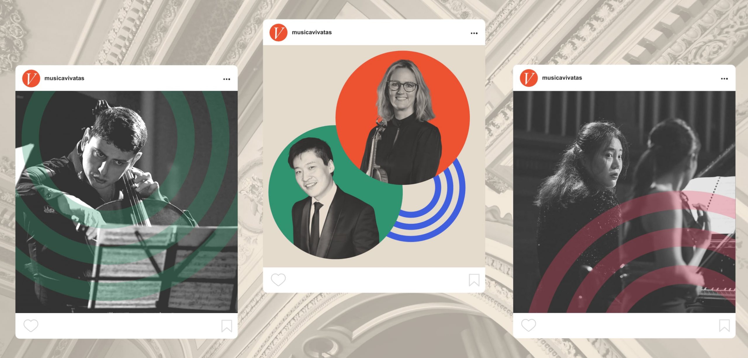
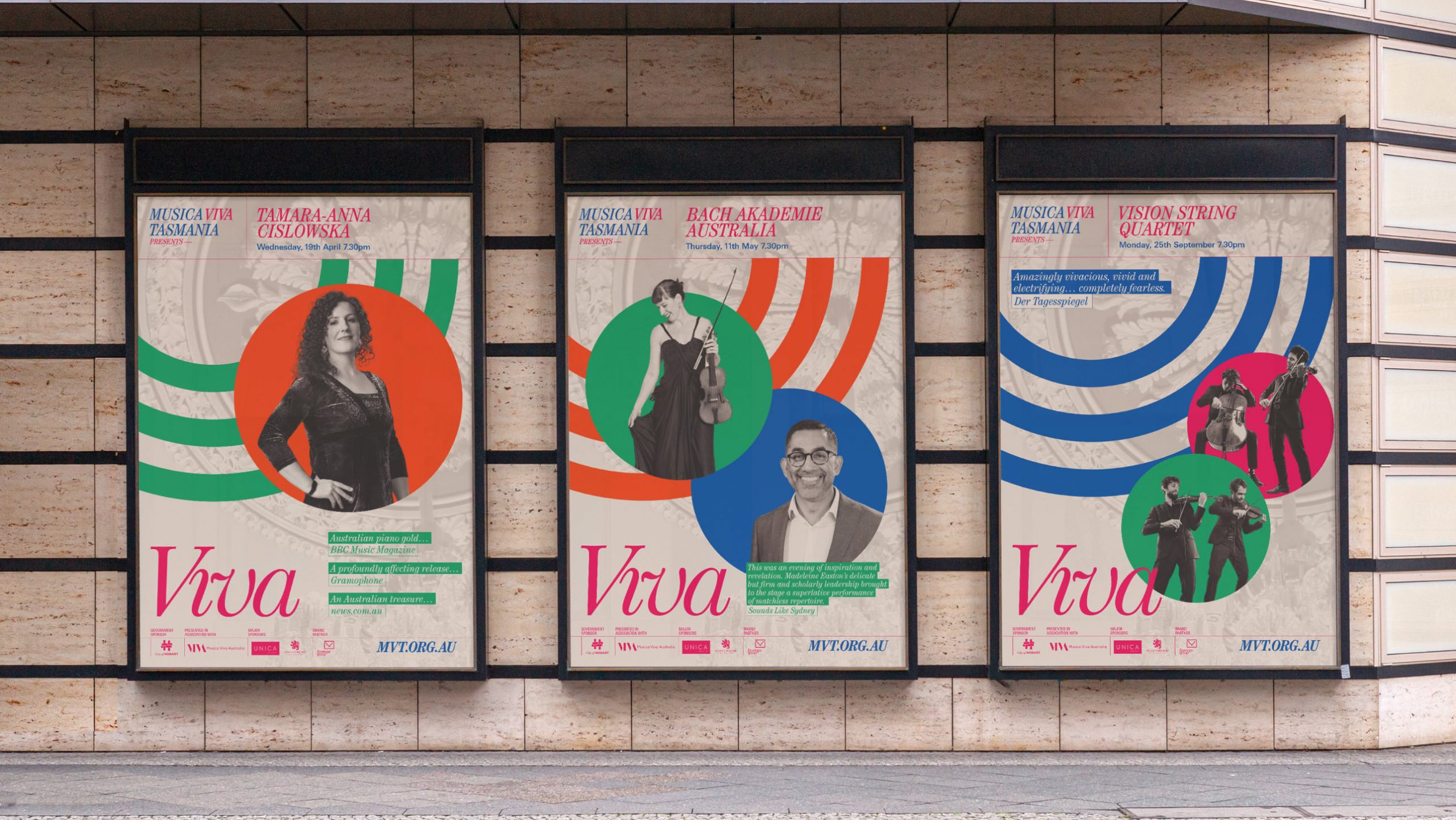
Photography provided by performers is disparate and often inconsistent in style. A flexible system built around the harmonisation of these images creates a cohesive framework for all communications. As a result, the organisation can create more impact with a streamlined campaign around festival season.
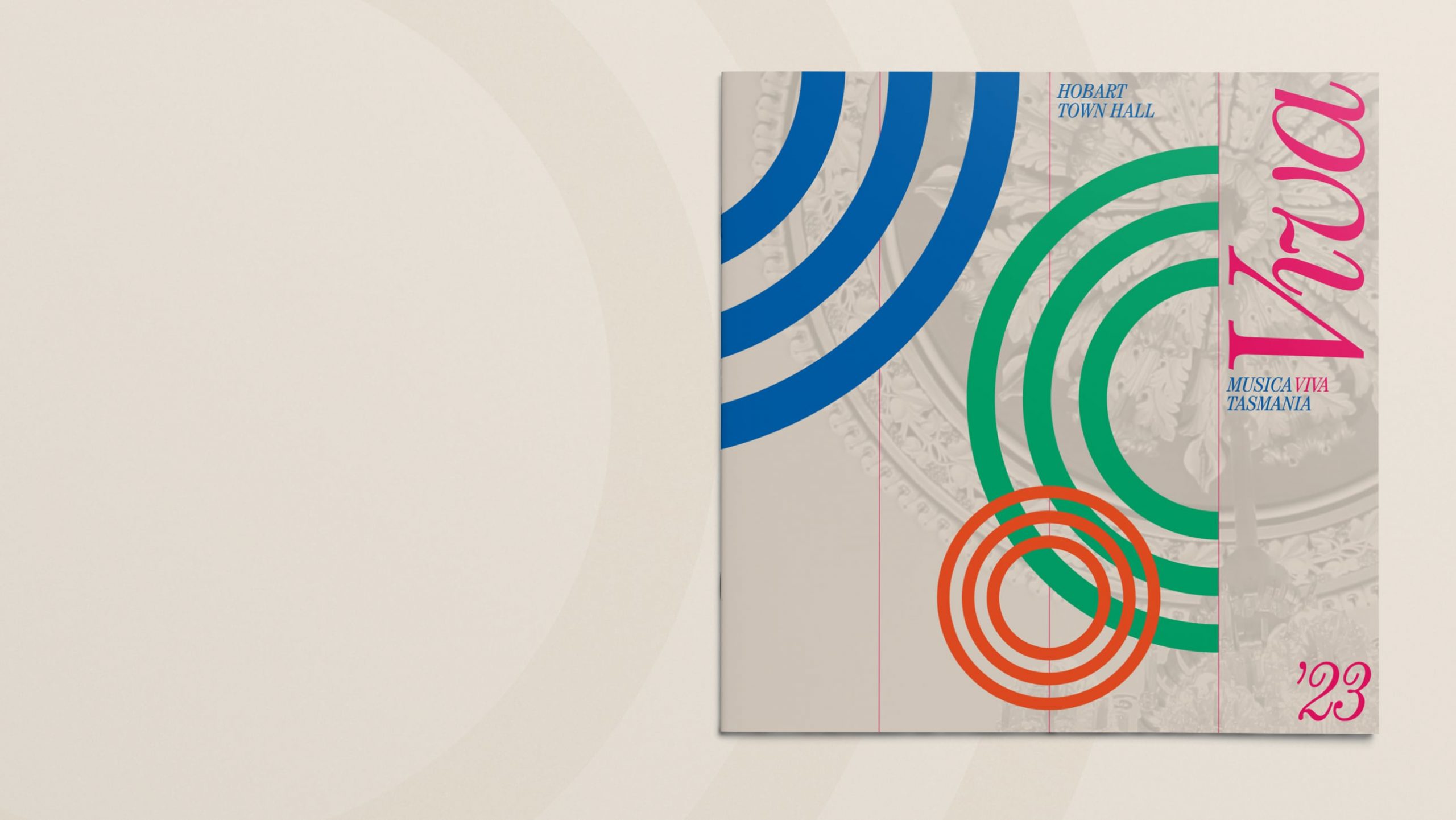
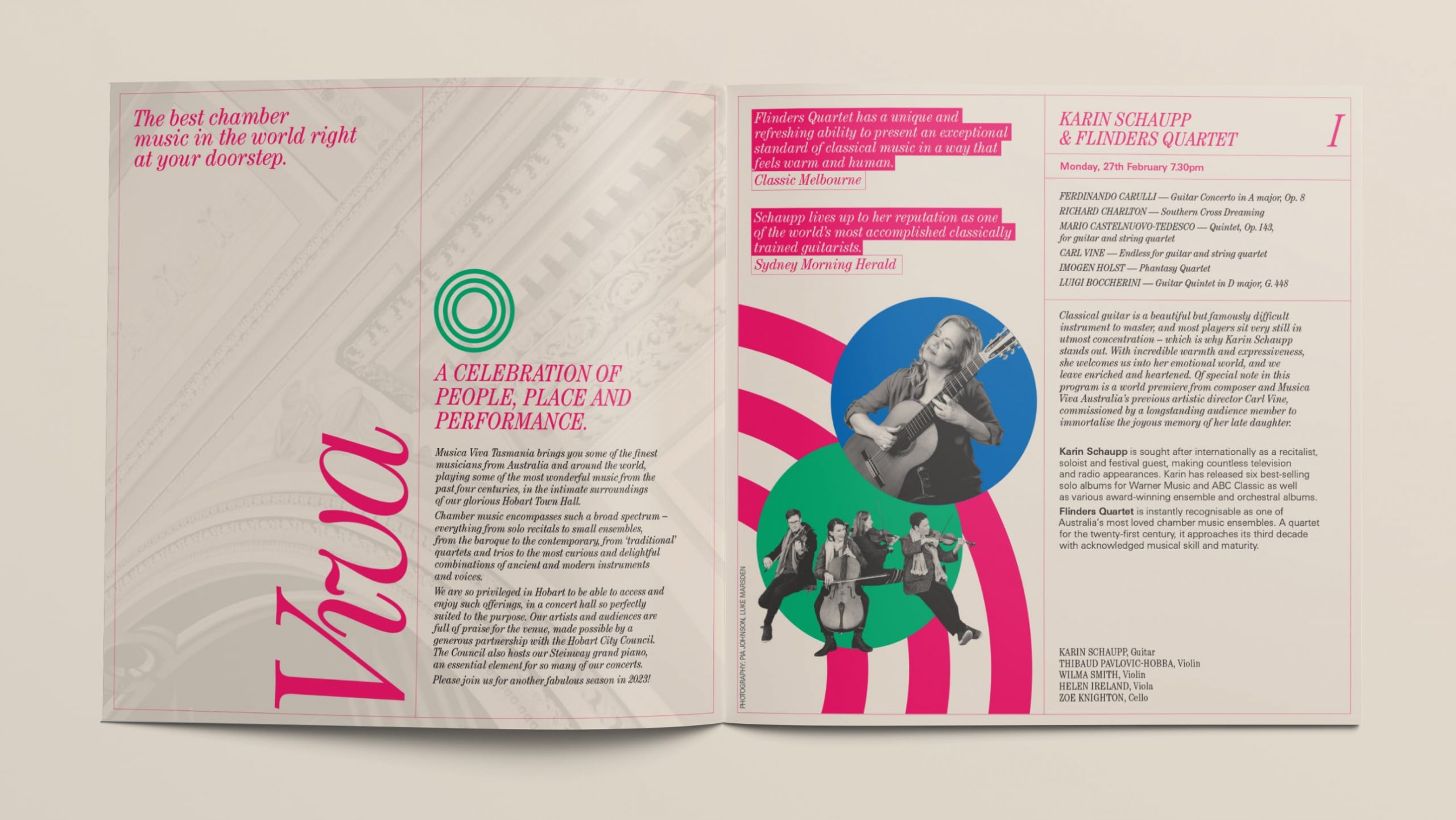
A redesigned square-format brochure is sent to previous attendees and features generous spreads of performers and audiences throughout.
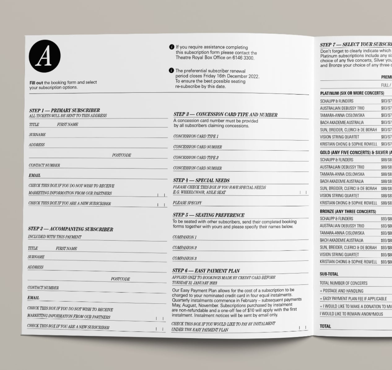
Many existing subscribers prefer to make selections using a paper booking form. With a new condensed programme brochure, this form is reformatted to make the step-by-step process clear. Steps to submit are clearly signposted.
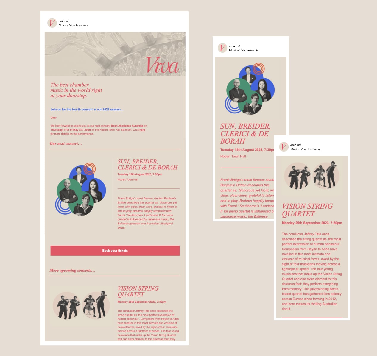
Evidence of poor audience engagement mid-season led to the creation of a promotional email campaign to drive sales in the lead-up to upcoming concerts.
digital
A major piece of the brand refresh includes a new digital home for the festival. I pitched, designed and developed a lively concept which shows the breadth of community and activity around the events — bringing together performer, audience and stakeholder interviews, as well as important performance and booking information.
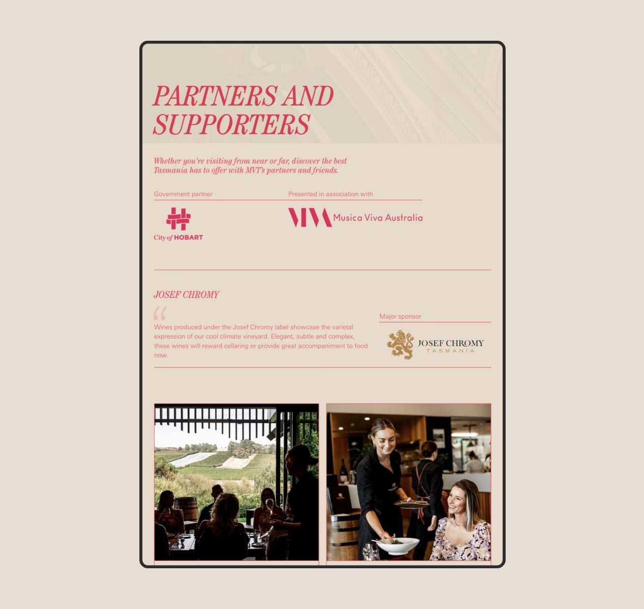
With many organisations tightening budgets, we looked to create a value-add proposition for the organisation's generous sponsors. Major sponsors are given a new platform to showcase their business to local and international audiences, ensuring continued support.
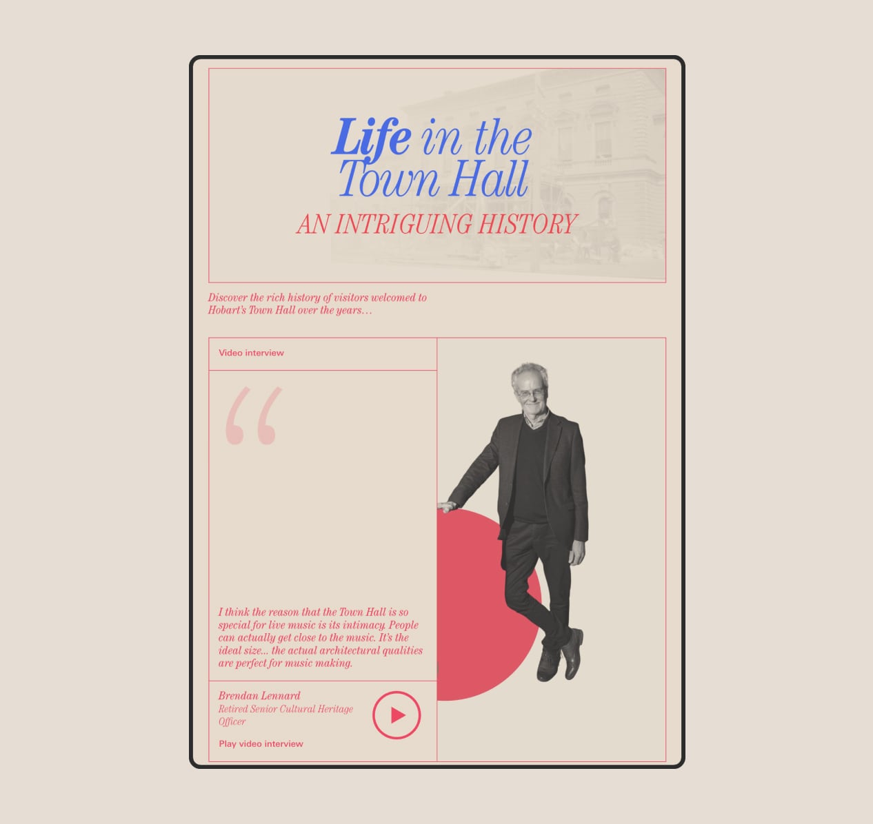
The unique history of Hobart Town Hall is platformed in a curated editorial, complete with video interviews.
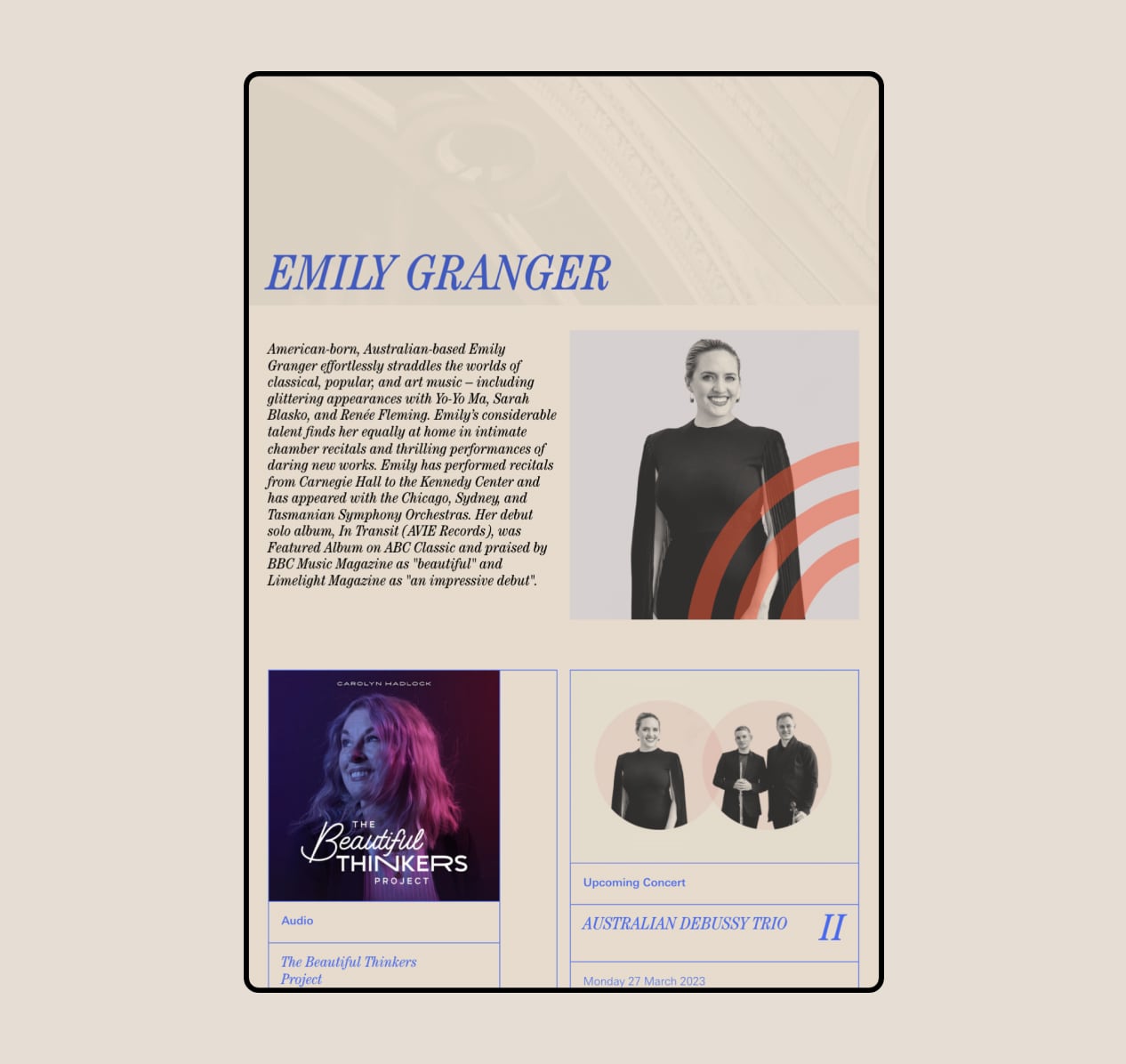
Engagement with the organisation's concert administrators found a wealth of artist content being provided, but not being utilised on the existing website. For the first time, each performer is given their own space on the website with a profile and interesting related media. From podcasts to previous performances, these profiles help to give audiences context and promote the live shows.
Ty and Graham have been excellent to work with, really understanding and caring about the unique place of Musica Viva Tasmania in Hobart’s cultural landscape. They always exhibit the highest standard of professionalism, with creativity and generosity.
Damian Stevens